Crafting an effortless sign up flow to increase conversion by 41%

" width="160.9999949884027px"><path d="M 8.259 5.019 C 7.585 4.442 6.734 4.118 5.85 4.102 C 5.189 4.102 4.282 4.531 4.282 5.259 C 4.282 5.988 5.248 6.349 5.91 6.597 L 6.817 6.897 C 8.742 7.506 10.251 8.483 10.251 10.729 C 10.35 12.145 9.802 13.529 8.764 14.486 C 7.651 15.377 6.267 15.849 4.847 15.823 C 3.111 15.781 1.426 15.224 0 14.223 L 1.561 11.308 C 2.414 12.173 3.552 12.691 4.758 12.765 C 5.598 12.765 6.505 12.337 6.505 11.368 C 6.505 10.399 5.062 9.97 4.334 9.79 C 2.104 9.181 0.617 8.573 0.617 5.838 C 0.617 2.983 2.602 1.157 5.375 1.157 C 6.893 1.182 8.383 1.579 9.716 2.314 Z M 15.009 0.03 L 15.009 7.085 L 15.068 7.085 C 15.744 6.108 16.863 5.543 18.042 5.583 C 20.458 5.583 21.603 7.168 21.603 9.595 L 21.603 15.373 L 18.287 15.373 L 18.287 10.451 C 18.287 9.362 18.109 8.197 16.8 8.197 C 15.492 8.197 15.053 9.354 15.053 10.451 L 15.053 15.32 L 11.738 15.32 L 11.738 0 Z" fill="rgb(221, 29, 33)" height="15.824390512646053px" id="q4AUmqG_x" transform="translate(56.904 0)" width="21.60265865367137px"/><path d="M 10.363 11.12 L 3.315 11.12 C 3.251 11.703 3.452 12.285 3.863 12.7 C 4.274 13.115 4.849 13.319 5.427 13.254 C 6.071 13.305 6.684 12.97 6.995 12.397 L 10.184 12.397 C 9.642 14.651 7.538 15.681 5.427 15.681 C 2.29 15.681 0 13.915 0 10.639 C 0 7.476 2.111 5.59 5.204 5.59 C 8.46 5.59 10.407 7.596 10.407 10.849 Z M 7.233 9.181 C 7.048 8.293 6.265 7.663 5.367 7.679 C 4.433 7.634 3.598 8.263 3.375 9.181 Z M 11.485 0 L 14.897 0 L 14.897 15.282 L 11.485 15.282 Z M 16.815 0 L 20.227 0 L 20.227 15.282 L 16.815 15.282 Z" fill="rgb(221, 29, 33)" height="15.680615537278193px" id="uldwNjt1q" transform="translate(79.949 0)" width="20.227402773168706px"/><path d="M 0 0.669 L 5.248 0.669 L 14.83 13.066 L 14.89 13.066 L 14.89 0.669 L 20.131 0.669 L 20.131 20.91 L 14.89 20.91 L 5.308 8.513 L 5.248 8.513 L 5.248 20.91 L 0 20.91 Z M 69.967 0.669 L 76.234 0.669 L 79.966 6.199 L 83.705 0.669 L 89.971 0.669 L 82.56 11.18 L 82.56 20.91 L 77.319 20.91 L 77.319 11.18 Z M 72.435 9.602 C 72.376 12.608 72.197 15.072 70.383 17.627 C 68.399 20.362 65.447 21.571 62.132 21.571 C 55.806 21.571 51.405 17.258 51.405 10.88 C 51.405 4.313 55.806 0 62.31 0 C 66.406 0 69.603 1.886 71.35 5.65 L 66.406 7.716 C 65.822 5.795 64.061 4.488 62.072 4.501 C 58.638 4.501 56.831 7.776 56.831 10.88 C 56.831 13.983 58.697 17.198 62.132 17.198 C 64.421 17.198 66.109 16.041 66.347 13.675 L 62.072 13.675 L 62.072 9.542 L 72.435 9.542 Z" fill="rgb(0, 151, 187)" height="21.571177328267552px" id="xbp9DZJQ7" transform="translate(71.029 19.159)" width="89.97144579406677px"/><path d="M 66.109 20.234 L 59.604 20.234 L 54.601 12.457 L 54.542 12.457 L 54.542 20.234 L 49.338 20.234 L 49.338 7.837 L 54.401 7.837 L 54.401 10.331 L 60.667 6.259 L 54.401 2.126 L 54.401 4.501 L 49.353 4.501 L 49.353 0.06 L 57.121 0.06 C 61.099 0.06 64.117 1.946 64.117 6.259 C 64.117 9.054 62.548 11.488 59.716 11.969 Z M 5.181 4.433 L 5.181 7.844 L 11.084 7.844 L 11.084 12.277 L 5.181 12.277 L 5.181 15.801 L 11.389 15.801 L 11.389 20.241 L 0 20.241 L 0 0 L 11.389 0 L 11.389 4.433 Z M 41.035 4.433 L 41.035 7.844 L 46.937 7.844 L 46.937 12.277 L 41.035 12.277 L 41.035 15.801 L 47.242 15.801 L 47.242 20.241 L 35.853 20.241 L 35.853 0 L 47.242 0 L 47.242 4.433 Z" fill="rgb(0, 151, 187)" height="20.241292832585476px" id="Z1azfdc6V" transform="translate(57.648 19.535)" width="66.1088959431413px"/><path d="M 19.388 39.616 L 8.237 39.616 L 7.256 31.291 L 0.424 26.249 C 0.132 24.788 -0.01 23.3 0.001 21.809 C 0.221 9.7 9.996 0 21.979 0 C 33.961 0 43.736 9.7 43.957 21.809 C 43.97 23.3 43.828 24.788 43.533 26.249 L 36.79 31.231 L 35.772 39.556 L 24.569 39.556 L 23.908 40.021 C 23.349 40.431 22.673 40.645 21.982 40.63 C 21.293 40.623 20.621 40.411 20.05 40.021 Z" fill="transparent" height="40.630739663384105px" id="KoKUKzCEa" stroke-dasharray="" stroke-linecap="butt" stroke-linejoin="miter" stroke-miterlimit="10" stroke-width="2.558" stroke="rgb(255, 255, 255)" width="43.95753733163612px"/><path d="M 19.388 39.616 L 8.237 39.616 L 7.256 31.291 L 0.424 26.249 C 0.132 24.788 -0.01 23.3 0.001 21.809 C 0.221 9.7 9.996 0 21.979 0 C 33.961 0 43.736 9.7 43.957 21.809 C 43.97 23.3 43.828 24.788 43.533 26.249 L 36.79 31.231 L 35.772 39.556 L 24.569 39.556 L 23.908 40.021 C 23.349 40.431 22.673 40.645 21.982 40.63 C 21.293 40.623 20.621 40.411 20.05 40.021 Z" fill="rgb(251, 206, 7)" height="40.630739663384105px" id="bWGG1CSHp" width="43.95753733163612px"/><path d="M 19.403 39.97 L 8.252 39.97 L 7.234 31.645 L 0.432 26.596 C -1.217 18.304 1.935 9.784 8.563 4.621 C 15.191 -0.543 24.145 -1.455 31.659 2.269 C 39.173 5.992 43.944 13.705 43.964 22.163 C 43.976 23.651 43.836 25.137 43.548 26.596 L 36.805 31.585 L 35.78 39.91 L 24.577 39.91 L 23.915 40.391 C 23.356 40.8 22.68 41.014 21.99 40.999 C 21.302 40.994 20.632 40.783 20.065 40.391 Z M 20.964 36.987 C 21.562 37.477 22.418 37.477 23.016 36.987 L 24.22 36.078 L 32.367 36.078 L 33.215 29.451 L 39.905 24.53 C 40.092 23.755 40.192 22.961 40.203 22.163 C 40.218 20.844 39.951 19.537 39.422 18.331 L 27.528 30.428 L 39.028 16.025 C 38.559 14.169 37.552 12.497 36.136 11.223 L 25.818 29.211 L 34.932 9.533 C 33.767 7.95 32.139 6.778 30.279 6.182 L 23.9 28.482 L 28.539 5.265 C 27.142 4.469 25.564 4.053 23.96 4.056 C 23.603 4.056 23.239 4.116 22.941 4.116 L 21.975 28.241 L 21.009 4.116 C 20.672 4.066 20.331 4.046 19.99 4.056 C 18.387 4.06 16.811 4.476 15.411 5.265 L 20.065 28.542 L 13.738 6.242 C 11.874 6.847 10.237 8.013 9.048 9.585 L 18.199 29.271 L 7.895 11.284 C 6.468 12.547 5.459 14.223 5.004 16.085 L 16.504 30.458 L 4.61 18.361 C 4.124 19.58 3.872 20.88 3.866 22.193 C 3.876 22.991 3.978 23.786 4.171 24.56 L 10.795 29.451 L 11.635 36.078 L 19.76 36.078 Z" fill="rgb(221, 29, 33)" height="41px" id="uKxiV6Lck" transform="translate(0.372 0)" width="43.96490478864549px"/></g></svg>)


Let's talk about the journey, not the destination
Jump to a section!
Project context
Framing the projects problem space, design process and how I measured success.
Client
Shell Energy & Powershop
Team
Delivery Lead
Engineering Manager
Product Design Lead
4x Developers
Client Partner
Duration
5 months
Impact
Sign up flow redesign
+41% Conversion
Website re-platform
What's the problem?
Problem space
Powershop's primary sales channel — an energy plan sign-up flow — was suffering from significant drop-off.
The legacy plan discovery and sign-up flow's user experience had declined over time through technical blockers and strict compliance requirements.
The form itself also struggled to manage different user types, offloading returning and existing customers onto customer service.
End to end feature design
Diagnosing pain points, exploring solutions and pressure testing their performance to launch features with confidence.
Look
Think
Test
Launch
Measuring success
Success for this project means driving sign-up conversion through effortless plan discovery and sign-up flow.
Increase sign-up conversion
Elevate conversion metrics through an overhauled e2e sign-up flow.
Reduce form drop-off
Alleviating drop-off rates at key parts of the user flow.
Offload operational cost
Reduce the dependency on Powershop's customer service teams through alternate problem resolution paths.
Pinpointing the challenges facing both users and the business
Although we had an idea of why this project was happening, there was so much more context needed to confidently make decisions on how to improve the experience.
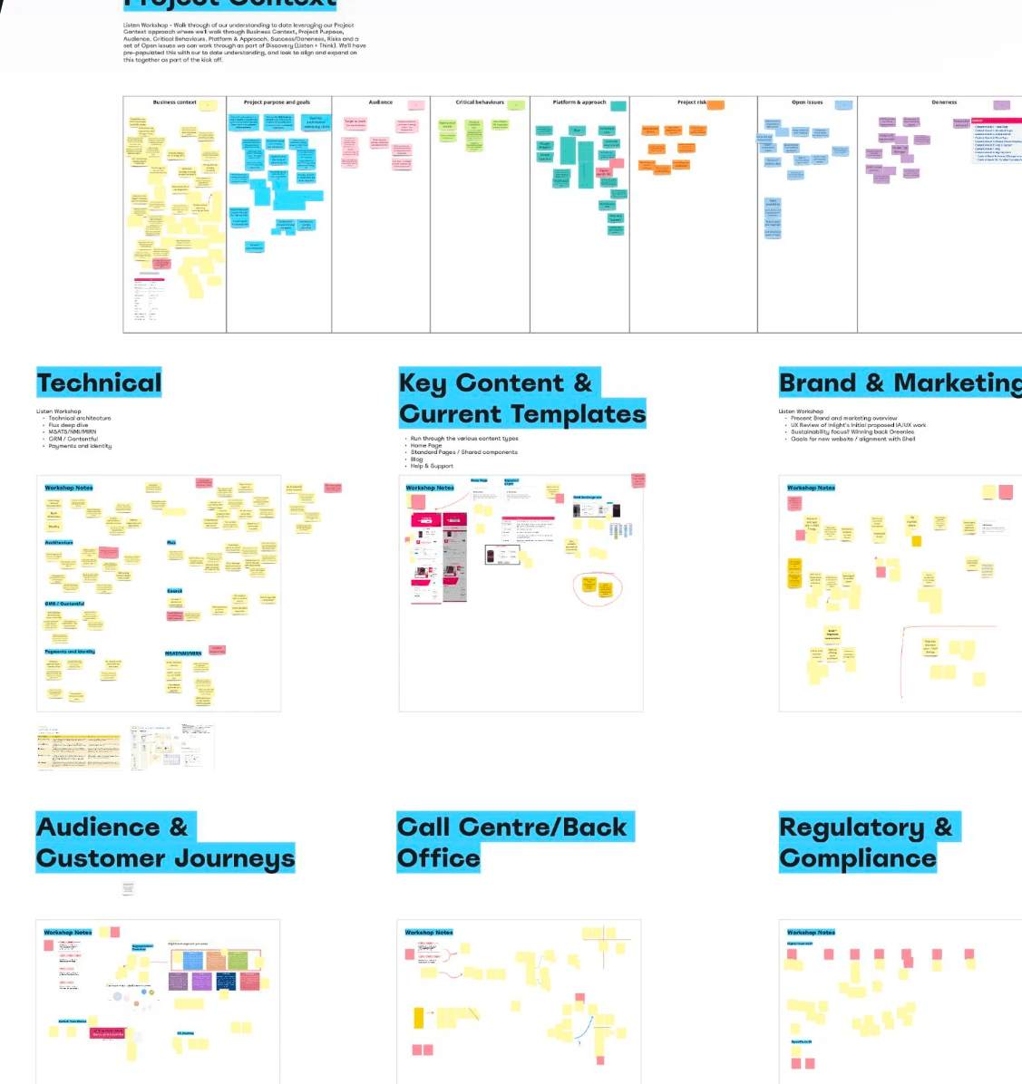
Asking the burning questions
Across nine workshops our team questioned the relevant aspects of the business to gain industry context, understand internal challenges and identify pain points.

Understanding what was going wrong
Through the immersion workshops, we quickly built a picture of where the experience was suffering most — framing the focus areas to explore.
Plan discovery
Address search was non-specific to the meter, leading to overestimated quotes to remain compliant.
18% of total searches deferred to customer service due to no address returned from API.
Regulatory and compliance information overwhelmed individual plan card UI.
No filter functionality to enable user to refine results based on their needs.
Sign-up form
Manual customer service process to capture user NMI (meter number) for accurate quote after sign-up.
Certain user journeys blocked mid form and referred to customer service.
Users inputs were not stored through the flow, requiring the user to repeat themselves.
Compliance requirements over time had increased the form length considerably to 6 steps.
There was no indication of how long the form would take.
Selected plans were not visible during the form.
Figuring out how to unblock our users
Multiple pain points pointed towards roadblocks in user journeys, induced by restrictive backend systems and compliance challenges. This became the most logical space to focus on for maximum reward.
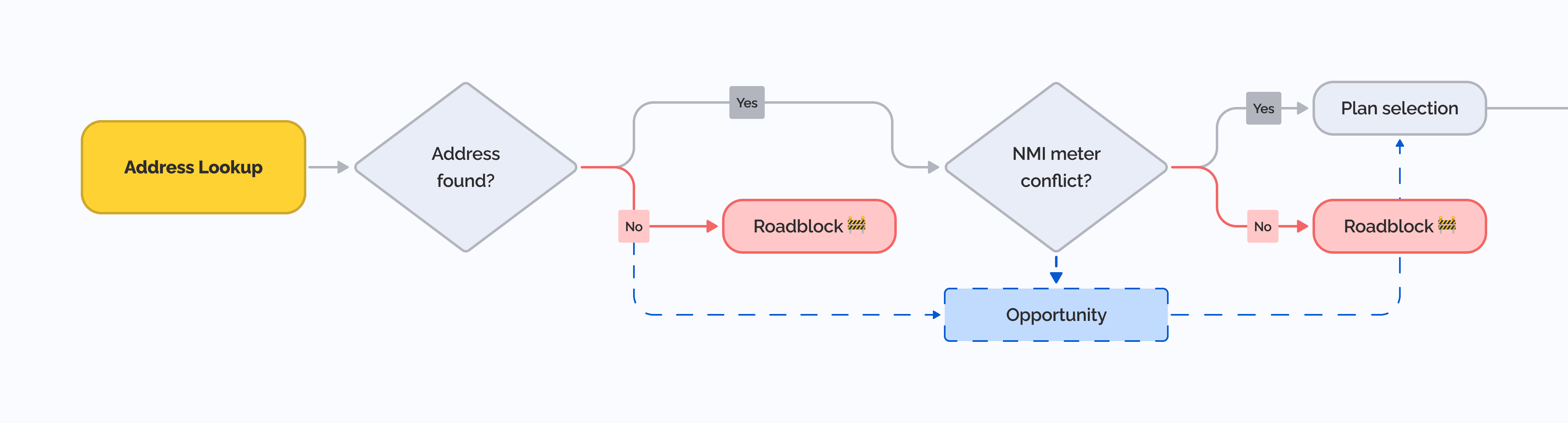
Unpacking the address lookup flow
I found the address lookup flow didn't provide enough flexibility to support self service in two areas, immediately offloading 18% of users to customer service before seeing plans and pricing.
When the users input didn't return a match — often due to inaccurate database records and recent subdivisions.
When the address had multiple NMI's (meter number) associated with it.

Stripping back the sign-up form flow
I found that the form had no capacity to service existing and returning customers, failing to enable self service activities and severely impacting retention.
The form's information architecture was impacting the usability of the form, hiding a customer service dependant process late in the flow — making all user effort to this stage redundant.
Removing complexity through a streamlined plan discovery and sign up flow
With a clear theoretical path towards unblocking users, I looked to also solve the other UX challenges spread across the experience.
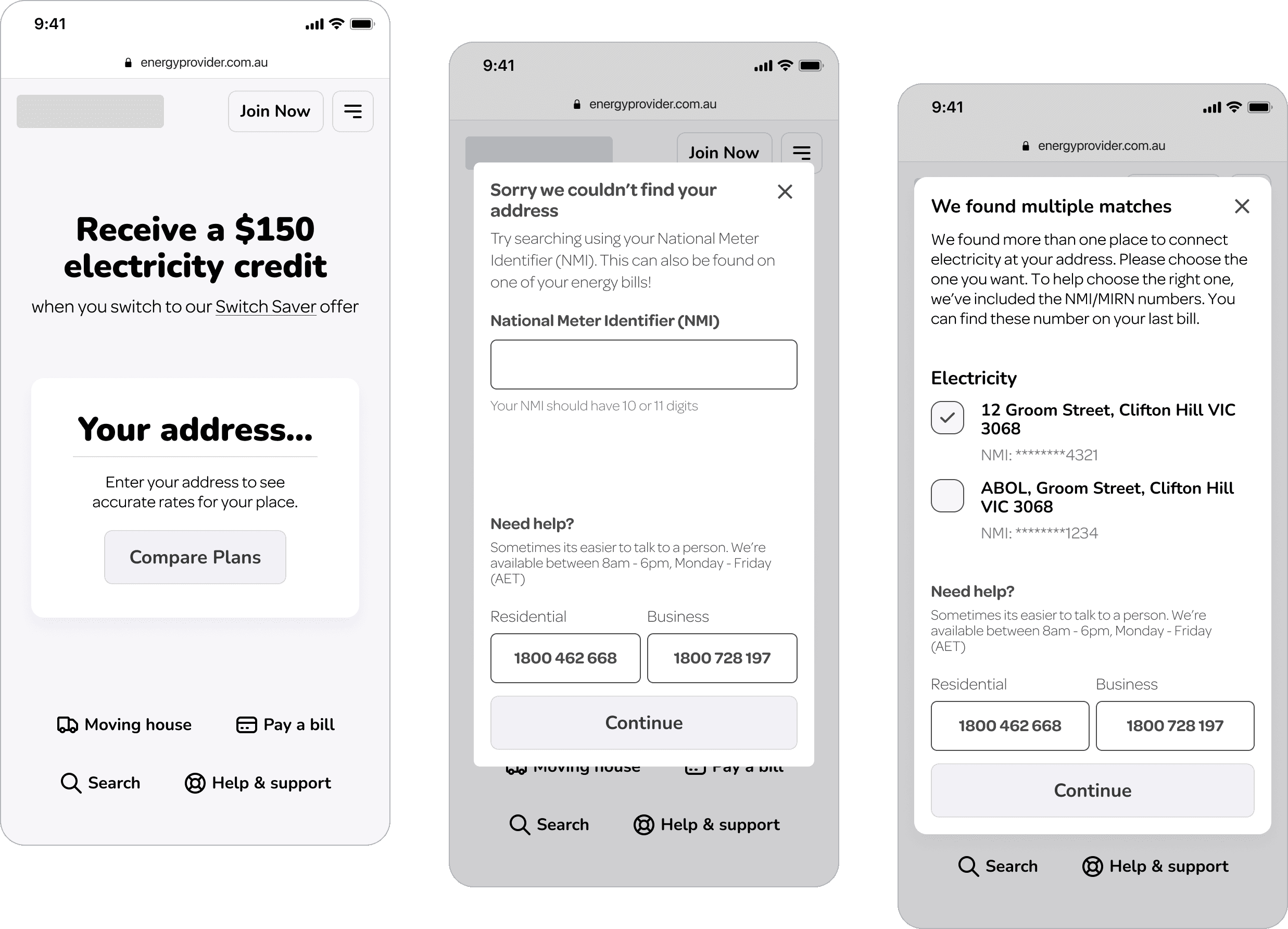
Unblocking the address lookup flow
Experimenting with alternate pathways by leveraging a unique NMI number for better accuracy.
Second line of defence when no address returned.
Allows users to resolve NMI conflicts themselves.
Offers clear problem resolution as last resort.
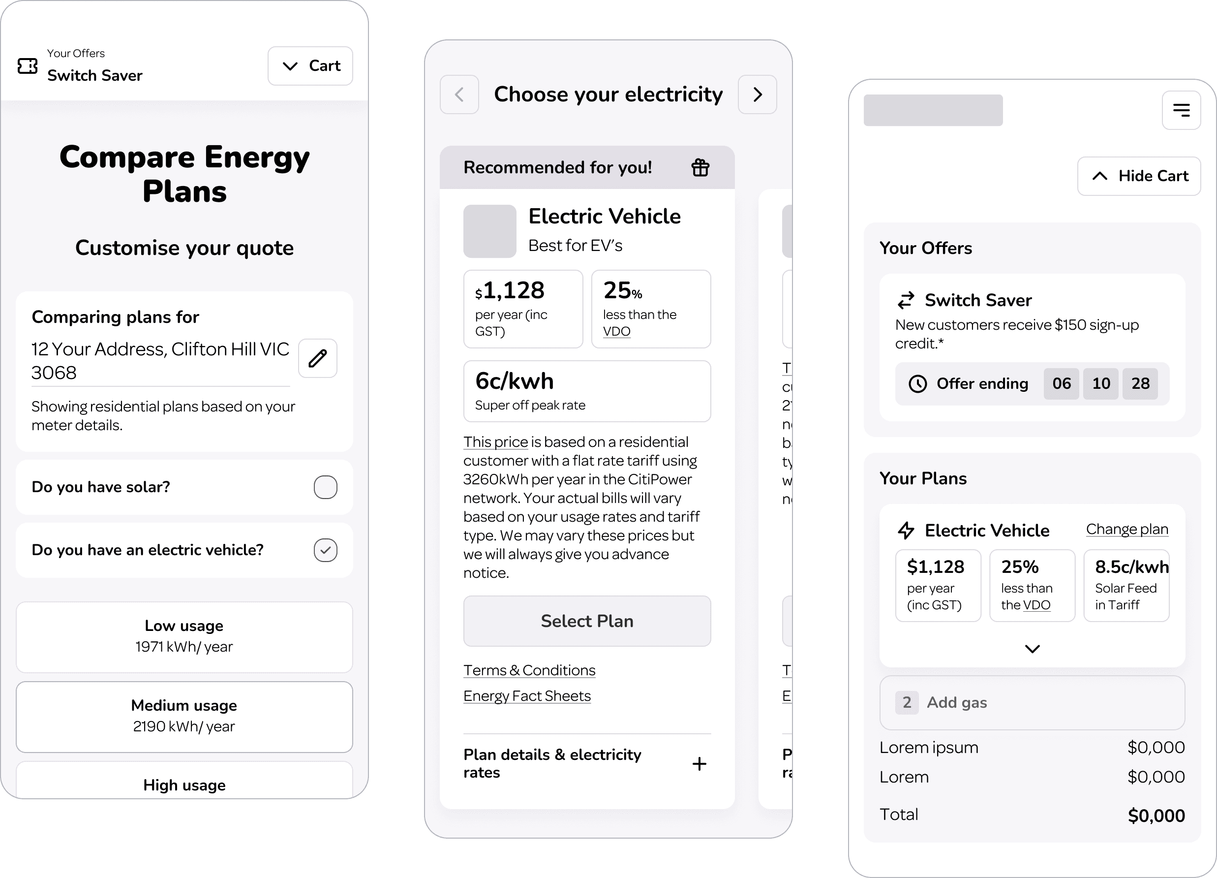
Simplifying plan discovery
Focusing on UX uplift through best practice design and landscape research.
Introduced customisation focused UI to help users find relevant plans.
Simplified plan card UI with minimum acceptable compliance requirements.
Surfacing recommendations and promotions with card banner.
Added cart surfacing offers/promotions and selected plans

Exploring the sign-up form flow
Designing an ideal flow from the ground up to guide users effortlessly through sign-up.
Reduced required fields and steps.
Introduced progress bar.
Revised form IA and field hierarchy.
Introduced existing customer flow.
Progressively revealing flow depending on answers.
Validating my approach with who matters most
Online testing designed to capture high level quantitative feedback reinforced by sentiment captured by qualitative questioning.
Test one: Plan discovery
Understanding user navigation through comparing and selecting plans.

Test two: Sign-up
Understanding sign up expectations and relevance/clarity of questions.
Validation
General usability across mobile and desktop devices was very consistent
68% of users interacted with filter options to find the best option for them
77% of users easily navigated around the gas step when not needing gas
Validation
90% of users said they expect signing up to take up to 5 minutes (65/100 said up to 10 minutes!)
After completing the task 94% of users said the ʻMy Detailsʼ section of the form was a reasonable length
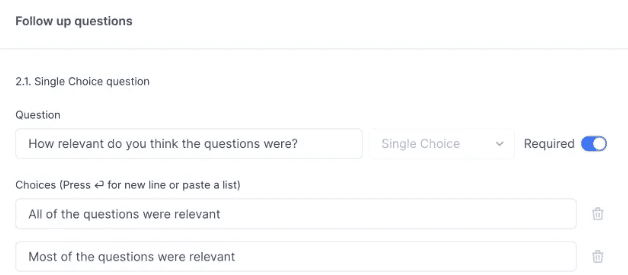
90% of users after completing the task said the questions were all relevant
Key insights
57% of users didn’t notice the promotion in their cart
Some users still found the quantity of information per plan overwhelming
Key insights
Users were really happy with the length of the form and relevancy of fields